Heuristic Analysis of the Original
Applet
|
Number |
HE1 -- Good Feature |
|
Description |
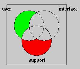
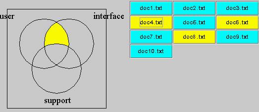
Display of Boolean Query with dynamic Venn diagram |
|
Evidence |
Heuristic: Simple and natural dialog Heuristic: Provide feedback When the user inputs the Boolean query’s parameters, the applet can use Venn diagram to present the relationship.
|
|
Explanation |
The dynamic display of Venn diagram will give the user very vivid picture of the relationship of the different words, also provides feedback information for manipulation of the different control. |
|
Severity/Benefit |
Good for beginner to understand the concept of how a document is considered to match or not match a user defined Boolean query |
|
Trade-Offs |
|
|
Relationship |
|
|
Submitted By |
Jidong Zou |
|
Number |
HE2 – Good feature |
|
Description |
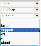
Choice of the words |
|
Evidence |
Heuristic: Minimize user memory load Heuristic: Prevent errors While inputting the words for Boolean query, the applet uses the pull-down menu for choice of the words
|
|
Explanation |
By using the pull-down menu, the user does not need to remember the words for the Boolean query. |
|
Severity/Benefit |
It not only saves the user’s memory for the action, but also will ensure the words’ relationship in Venn diagram and also prevent the inputting misspelled words |
|
Trade-Offs |
|
|
Relationship |
|
|
Submitted By |
Jidong Zou |
|
Number |
HE3 -- problem |
|
Description |
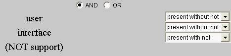
Choice of logic relationship |
|
Evidence |
Heuristic: Speak the user’s language When the user chooses logic relationship for the Boolean query, The choice and also the feedback are really confusing. For instance, look at the following example, it is difficult for user to understand what is “present with not” or “present without not” and the their corresponding feedback, such “user interface (NOT support)”
|
|
Explanation |
Without clear explanation of how to do it, with the confusing wording like above ones, the user will find difficult to use the applet. |
|
Severity/Benefit |
Serious. It is confusing use the expressions which common users are not familiar. |
|
Possible solutions |
It might help if we change “present without not” into “yes” and “present with not” into “not”. And also present feedback information which are easier to be understood by users. For instance, turn the above feedback information into “User AND Interface AND (NOT Support)”. |
|
Relationship |
|
|
Submitted By |
Jidong Zou |
|
Number |
HE4 – problem |
|
Description |
No stop, pause or reset button |
|
Evidence |
Heuristic : Provide clearly marked exits On the interface of the applet, there is only one button, that is submit button, which is used to submit the user defined Boolean query. But there is no stop, pause, or reset button.
|
|
Explanation |
Without pause or reset button, it is difficult for user to change his/her choice about the query or s/he can’t get out the applet quickly if s/he is not interested in the applet. |
|
Severity/Benefit |
Medium. Without the buttons above, the user can only stop or exit the applet by exiting the whole program |
|
Possible solution |
Add a pause and reset buttons |
|
Relationship |
|
|
Submitted By |
Jidong Zou |
|
Number |
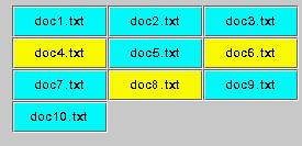
HE5 – Good feature |
|
Description |
Display status of files |
|
Evidence |
Heuristic: Provide feedback When the applet searches the words in the documents, it will present different colors for different status of file. For instance, the following yellow file denotes that the files match the Boolean query the user defined, the blue one that the files do not match the user defined query.
|
|
Explanation |
The use of different colors can tell the user the different status of the file, so the user can decide whether s/he will go to the particular file again to see for details. |
|
Severity/Benefit |
A good feedback will strengthen the effect of the interface. |
|
Trade-Offs |
|
|
Relationship |
|
|
Submitted By |
Jidong Zou |
|
Number |
CH6 – good features |
|
Description |
Consistent Colors for the file status |
|
Evidence |
Heuristic: Be consistent When a document matches the user’s defined Boolean query, on the Venn diagram, the corresponding overlapped area is yellow in color, while the file name is also yellow in color.
|
|
Explanation |
Using the same color for denoting the status in different places can be easier for the user understanding the whole applet. |
|
Severity/Benefit |
The consistent use of color will benefit user a lot. |
|
Trade-Offs |
|
|
Relationship |
|
|
Submitted By |
Jidong Zou |
|
Number |
HE7- Good features |
|
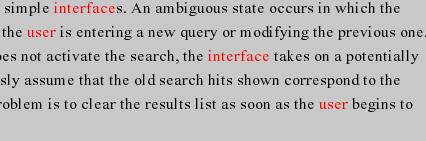
Description |
The color of the words in search |
|
Evidence |
Heuristic: Provide feedback When the applet search the words which the user has chosen in documents, the searched document appear on the applet with the words to be searched in red color.
|
|
Explanation |
Using the different color to denote the words to be searched will give a good reference for the user to compare the document with the Venn diagram. |
|
Severity/Benefit |
The use of different colors for the searching word can help users to understand better the concept of Boolean query. |
|
Trade-Offs |
|
|
Relationship |
|
|
Submitted By |
Jidong Zou |
|
Number |
HE 8 (good feature) |
|
Description |
Using the same design at the top of each page of the website. |
|
Evidence |
Heuristic: Be Consistent
|
|
Explanation |
Using the same design on each page of a website makes the user comfortable. He feels that he is familiar with all the pages. |
|
Benefit |
Users will be willing to re-visit the website again and again. |
|
Trade-Offs |
Sacrificing some space that could be useful for any functionality. |
|
Relationship |
|
|
Submitted By |
Faisal Jamalallail |

|
Number |
HE 9 (problem) |
|
Description |
Using objects look like links. |
|
Evidence |
Heuristic: Speaks the user’s
language
|
|
Explanation |
The user might think that these objects that were used as bullets are links. |
|
Severity |
Causes some confusion to the user. |
|
Possible solutions |
Choose other objects with other colors. |
|
Relationship |
|
|
Submitted By |
Faisal Jamalallail |
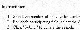
Number |
HE 10 (problem) |
|
Description |
Long scrolling pages. |
|
Evidence |
Heuristic: Be Consistent Heuristic: Minimize user memory
load
|
|
Explanation |
The users (especially new ones) could get confused, and loose some data when dealing with long-scrolling pages. When we look at the demonstration page, the user cannot see the instruction if he wants to look at the whole applet. |
|
Severity |
User will not feel the consistency of the page. In addition, it will distract users using the demonstration page. |
|
Possible solutions |
|
|
Relationship |
|
|
Submitted By |
Faisal Jamalallail |
|
Number |
HE 11 (problem) |
|
Description |
Bad use of colors |
|
Evidence |
Heuristic: Simple and natural
dialog
|
|
Explanation |
Although it is meaningful to use these colors, but it is bothering for the users eyes. |
|
Severity |
User might not be able to see the colored words clearly. In addition, very bright colors hurt the eye. |
|
Possible solutions |
Make a background for this area. |
|
Relationship |
|
|
Submitted By |
Faisal Jamalallail |
Number |
HE 12 (good feature) |
|
Description |
Providing instructions |
|
Evidence |
Heuristic: Speak the user’s
language
|
|
Explanation |
Giving instruction for the users about the task (Boolean query) of this website. |
|
Benefit |
Giving instruction for the users (especially beginners) makes it easy to use the website |
|
Trade-Offs |
|
|
Relationship |
|
|
Submitted By |
Faisal Jamalallail |
Number |
HE 13 (good feature) |
|
Description |
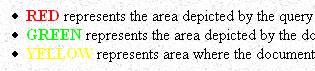
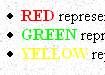
Demonstration of the color meanings |
|
Evidence |
Heuristic: Minimize user memory
load
|
|
Explanation |
Describing in words, what does each color represent. |
|
Benefit |
Give a quick understanding for the user from the first use. |
|
Trade-Offs |
|
|
Relationship |
|
|
Submitted By |
Faisal Jamalallail |