| front |1 |2 |3 |4 |5 |6 |7 |8 |9 |10 |11 |12 |13 |14 |15 |16 |17 |18 |19 |20 |21 |22 |23 |24 |25 |26 |27 |28 |29 |30 |31 |32 |33 |34 |35|36 |37 |38 |39 |40 |41 |42 |43 |44 |45 |46 |47 |48 |49 |50 |51 |52 |53 |54 |55 |56 |57 |58 |59 |60 |61 |62|63 |64 |review |
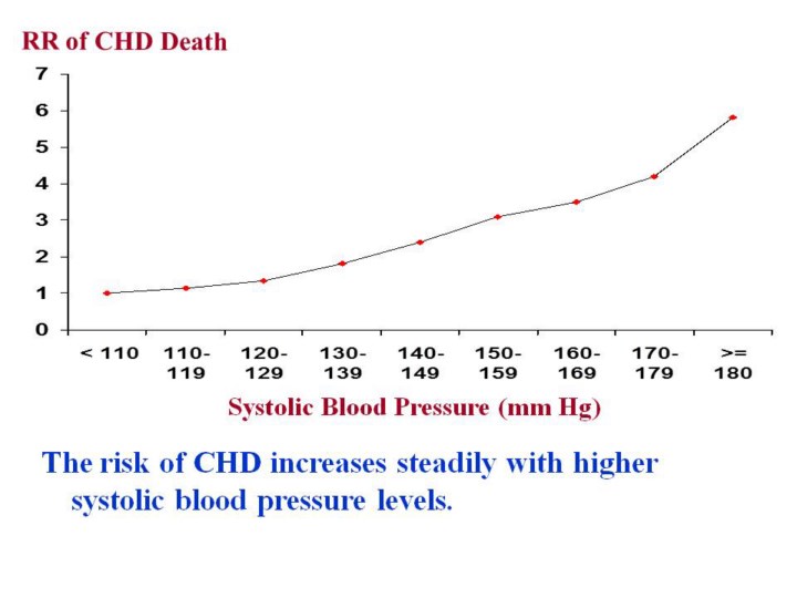 |
1.As
seen in this graph, the risk of dying from coronary heart disease
increases steadily with higher systolic blood pressure levels.
2.It
is often difficult to decide as to which point on the blood pressure
curve we should intervene to try to reduce deaths from coronary heart
disease.
|