| front |1 |2 |3 |4 |5 |6 |7 |8 |9 |10 |11 |12 |13 |14 |15 |16 |17 |18 |19 |20 |21 |22 |23 |24 |25 |26 |27 |28 |29 |30 |31 |32 |33 |34 |35 |36 |37 |38 |39 |40 |review |
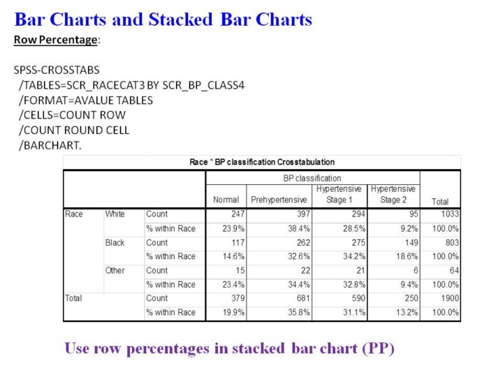 |
1.In
this example, we switched the SPSS syntax to ask for the row
percentages.
2.These
data can now be “stacked” in Power Point to show the distribution of
blood pressure by race.
3.Programming
note: needs to exit this Power Point file so that a new graph can be
created in Power Point.
|