| front |1 |2 |3 |4 |5 |6 |7 |8 |9 |10 |11 |12 |13 |14 |15 |16 |17 |18 |19 |20 |21 |22 |23 |24 |25 |26 |27 |28 |29 |30 |31 |32 |33 |34 |35 |36 |37 |38 |39 |40 |review |
 |
1.Now
we want to learn how to draw a “high-low” chart that is similar to a box
plot. This type of graph is frequently used to present the distribution
of a continuous variable for 2 or more groups.
2.Our
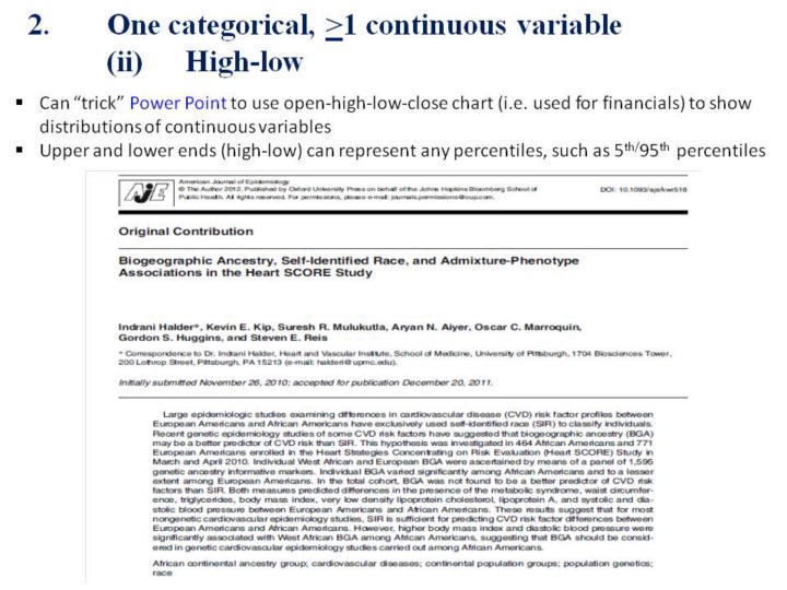
example is based on a “new” way to classify ancestry instead of the
conventional racial categories of “White” and “Black”.
3.With
admixture analyses, we can obtain a score that represents the percentage
of ancestry from a specific racial group.
|