| front |1 |2 |3 |4 |5 |6 |7 |8 |9 |10 |11 |12 |13 |14 |15 |16 |17 |18 |19 |20 |21 |22 |23 |24 |25 |26 |27 |28 |29 |30 |31 |32 |33 |34 |35 |36 |37 |38 |39 |40 |review |
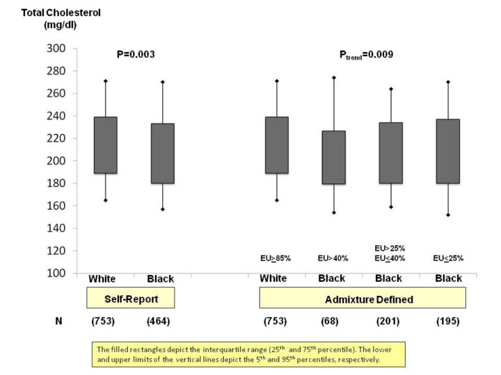 |
1.Here
is an example as to how total cholesterol levels can be plotted by the
self-report racial categories of White and Black, and by self-report
racial categories and extent of European admixture.
2.As
stated in the note on the slide, the filled rectangles depict the
interquartile range and the lower and upper limits (filled diamonds)
depict the 5th
and 95th
percentiles.
3.The
percentiles to depict is arbitrary. For example, one could depict the
interquartile range and 10th
and 95th
percentiles.
|