| front |1 |2 |3 |4 |5 |6 |7 |8 |9 |10 |11 |12 |13 |14 |15 |16 |17 |18 |19 |20 |21 |22 |23 |24 |25 |26 |27 |28 |29 |30 |31 |32 |33 |34 |35 |36 |37 |38 |39 |40 |review |
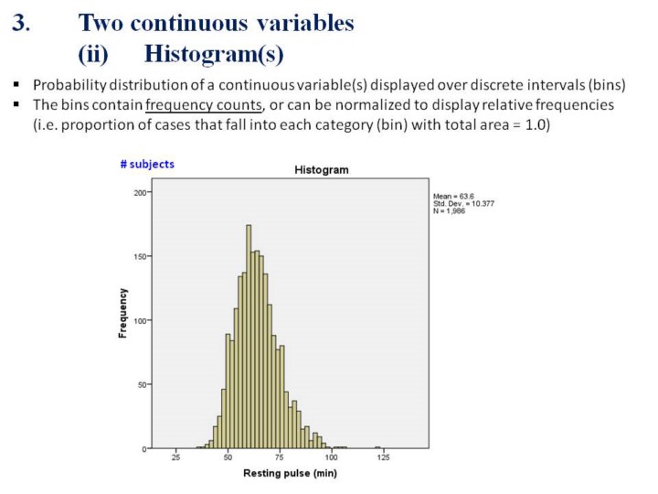 |
1.Here
is an example of a histogram for resting pulse values generated from
SPSS.
2.The
frequency of specific values (for resting pulse) are displayed in
“bins”.
3.This
type of graph provides a good indication as to whether the variable of
interest (e.g. resting pulse) is normally distributed.
|